How to design a newsletter

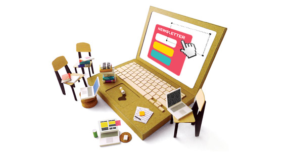
Creating a good newsletter template is not easy. The art of crafting an email requires skills both as a coder and as a web designer: things that you learn only with time and effort, plus a bit of personal creativity that no one can teach you. However, we have selected ten main suggestions about how to design a newsletter:
- Focus both on your industry, and on your users. The purpose of your newsletter must be crystal-clear to you first: if it’s not, what can you expect from your costumers? The whole communication strategy has to be crafted thinking about your audience: what they want to hear, what may entice them, what they are expecting from your brand. And this affects your email design as well.
- Call to action. The newsletter design should be neat and elegant, but never an end in itself: it’s meant only to convey your content – and you must do that in the more coherent and readable way. After all, what you need is to drive your users’ attention to convert (subscribe, click on a link, buy etc.): so craft carefully the template to emphasize your call to action.
- Respect your brand. Your newsletter design should mirror both your type of commerce (that is why we have sorted our templates by many different categories), and your brand. If you run a digital bookstore, for instance, it would probably be a bad choice to overload your newsletter with supposedly super-funny graphics. More in general, always try to make your email design the more coherent with your website.
- Be original but don’t overdo. Originality is always appreciated – and will help your newsletter to stand out in the user’s inbox – but simplicity is even more appreciated. Don’t try to impress too much, cut straight to the point.
- Use lightweight images. In a newsletter design, images speak often louder than words. It’s very important, however, to provide always an alternative text for any image, do not use background images (unsupported by many clients), and, please: no animated GIFs.
- Don’t make it too wide. Stay around the ideal width of 600 pixels. Especially considering that a relevant part of your audience will probably open the newsletter on a mobile device.
- Merge graphics and text. There should be no discontinuity between graphic elements and your content: bullet points, web-safe fonts, dividing lines, etc. will be part of the content itself: graphics will help words, which in turn will reinforce the former.
- Use tables and code well. Always double check your HTML code and use tables. Unfortunately, even if they’re quite despised in modern web design, tables are still the best way to ensure a proper rendering and organize your content in a newsletter.
- Don’t forget the footer. It’s not a no-man’s-land. Craft it with the same care: you can put there your company details, unsubscribe button or social network contacts.
- Test. A lot. One of the most annoying things for newsletter designers is that email templates don’t look the same on every browser, mail client or device. So the only way is to test your layout everywhere: on Gmail, Hotmail, Thunderbird, Outlook, mail apps for iPhone, iPad and Android phones, different browsers like Chrome and Firefox… A lot of hard work, certainly. But also necessary.
For our part, we constantly apply these and many other suggestions to provide you the best newsletter templates you could want.
As a bonus, you can also download free our ebook Advanced Email Marketing, that contains a lot of other great tips about how to design a perfect email layout.
